PlatinumGames: ‘UI Design In Bayonetta 2’

NintendObserverLooking smooth and shiny.


☆ NintendObs Weekly – Monday, August 18, 2014 – Sunday, August 24, 2014.

Bayonetta 2


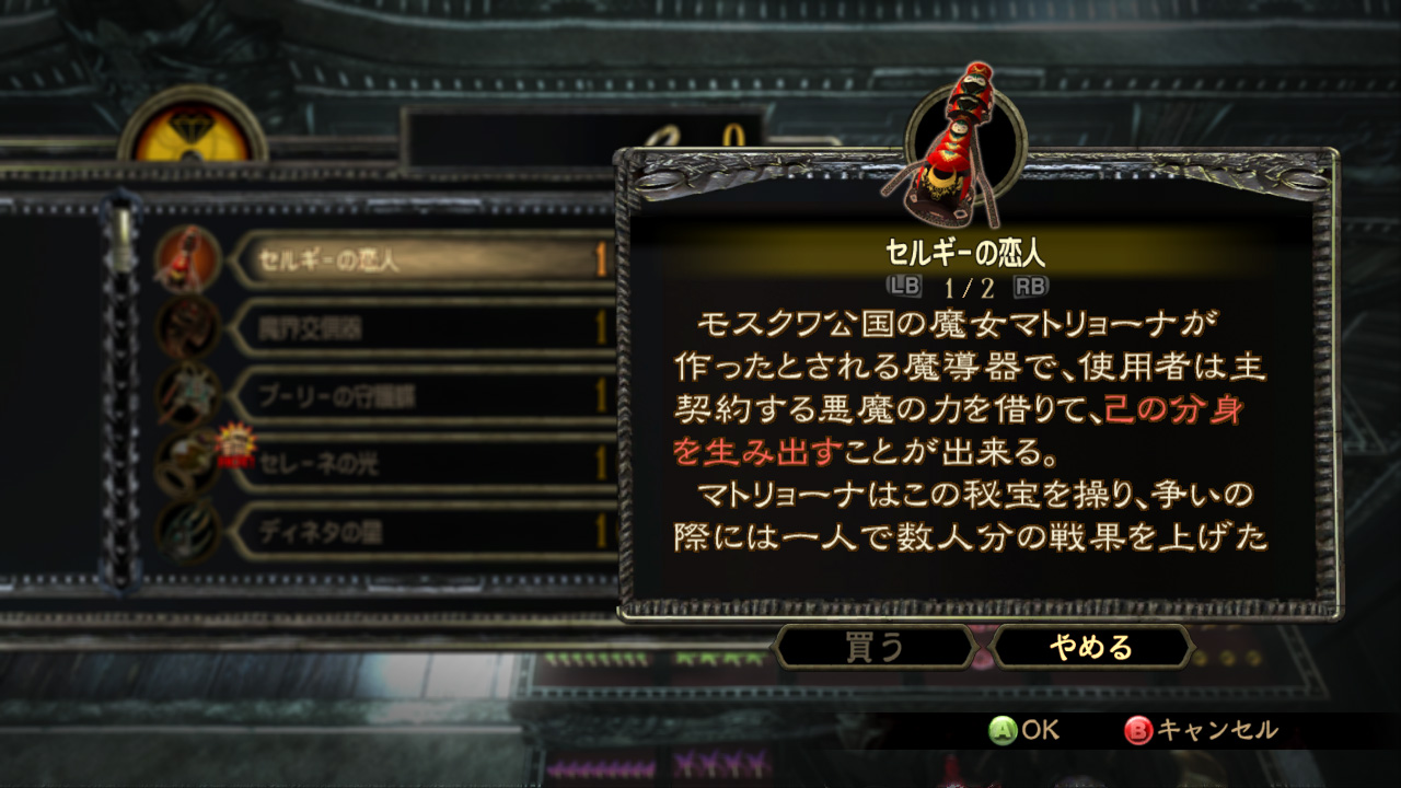
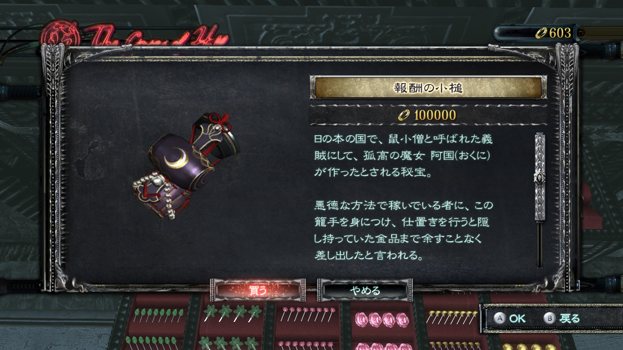
Shop Screen

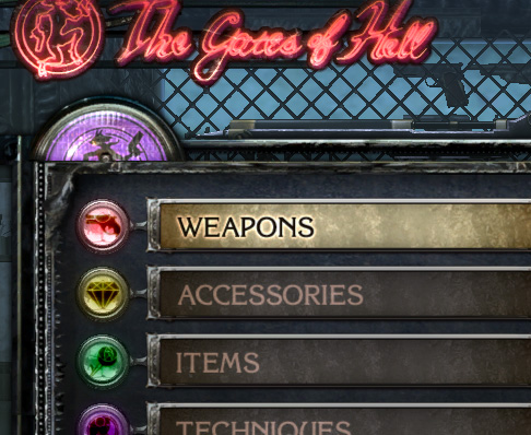
Bayonetta

Bayonetta
“The shop screen from the previous game.”


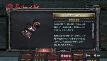
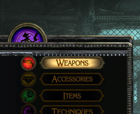
Bayonetta 2

Bayonetta 2
“Shop screen from Bayonetta 2 (layout/animation redesigned to place more emphasis on item images, making the items look like real objects vs. thumbnails).”


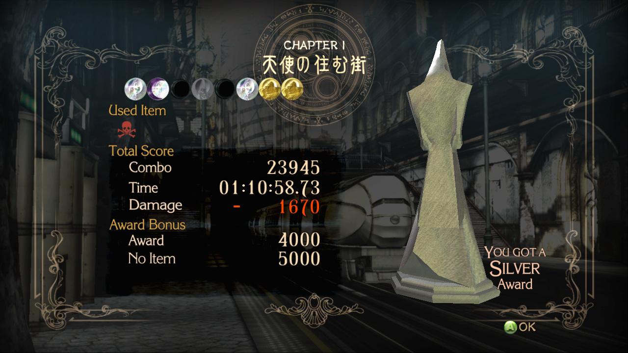
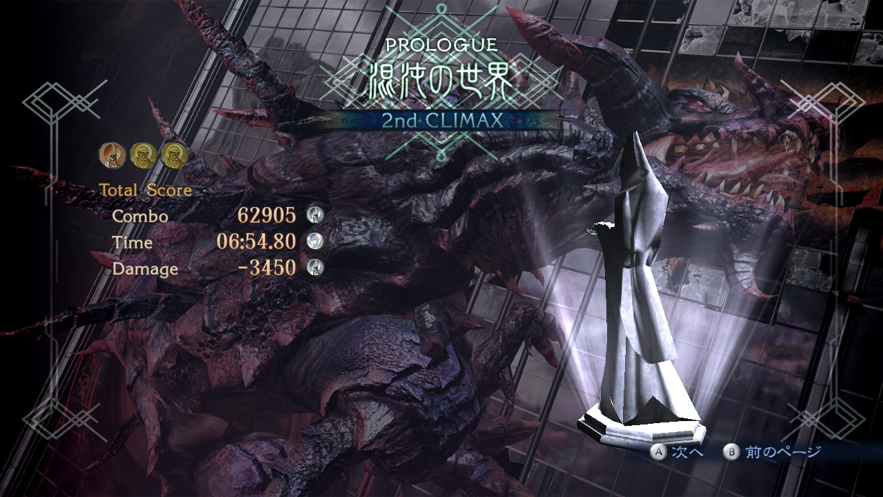
Chapter Result Screen

Bayonetta
“The Chapter Result Screen from the original Bayonetta.”


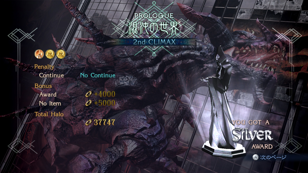
Bayonetta 2

Bayonetta 2
“The newly revised Chapter Result Screen in Bayonetta 2 (the first page is for award related items, the second page is for non-related items).”


Source: Platinum Games.
Captions from Hisayoshi Kijima, in charge of UI on Bayonetta 2.


At NintendObserver, the comments are on Discord.

Click on Community to learn more. 🙂

…Wanna play? Buy a Wii U.

And if you’ve already got yours, click on Bayonetta 2 for everything you need to know about the game. 😀